The absence of evidence for a calculus crisis at UC Berkeley
Author
D. Hicks
Published
September 27, 2026
NoteAbout me
I’m an Associate Professor in the Philosophy Department at UC Merced. My PhD is in philosophy of science, but I started my career as a mathematician. I was in the pure math PhD program at the University of Illinois, Chicago — I was especially interested in topology and logic — and left with a MS when I decided to switch fields. I was a calculus TA for several semesters at UIC, and have taught Algebra II, Linear Algebra, a bespoke course on chaos theory and fractals at a “nerd camp,” and mathematical logic courses up through modal logic.
After my PhD, I spent two years working in science policy as a AAAS Science and Technology Policy Fellow; I used this time to retrain myself in statistics and data science. I then returned to academia, doing a postdoc at UC Davis with Duncan Temple Lang, where I worked on various projects under the general headings of bibliometrics and institutional research. I was hired into a tenure-track position at UC Merced in 2019. At that time philosophy was part of the Cognitive and Information Sciences department, and my first few years there I taught a graduate data science methods course. Philosophy became a separate department in July 2023, and I received tenure at the same time.
Today my research includes both methodologically traditional/disciplinary philosophy and empirical computational social science. Much of the latter work has involved the opportunistic use of found data, rather than original data generated by experiments or collected systematically with fieldwork. For example, I’ve published several studies using bibliometrics — analyzing the metadata from scholarly journal articles — and text mining analyses of the content of those articles.
The primary advantage of found data is that it traces “actual” or “real” behavior, outside of the artificial environment of an experiment or survey. But for the same reason, found data reflects all of the messiness of “real life.” It can easily be incomplete and underdocumented.
Supporters of the UC system bringing back the SAT argue that “current admissions practices do not provide a sufficiently reliable check on mathematical readiness for STEM majors.” They point primarily to a report out of UCSD, which shows a significant increase in demand for remedial math courses and argues that this is due (at UCSD in particular) to increased enrollments from under-resourced LCFF+ high schools. But in some cases SAT proponents also point to a report by Stankova and some other Berkeley faculty, which claims there has been a dramatic drop in preparedness in Calculus I courses since UC went test-free in 2020. In this post, I focus exclusively on the situation at Berkeley.
Looking into the claims from Stankova et al., I happened to discover that ASUCB and the UCB Provost’s office have a public course grade dashboard, which provides data on the distribution of final letter grades for many courses over the past decade or so. I used Claude Code to scrape these data for eight math courses,1 from Fall 2015 through Spring 2026:
In this post, I first analyze three variables across these courses over time: enrollments, course GPA (average course grade over students who received a letter grade), and rate of failing grades. I then discuss a number of significant data gaps in the UCB report. In both sections I argue that the available data are at best highly ambiguous, and don’t provide compelling support for either side of the SAT debate. I conclude with some thoughts on how UC should approach the SAT question given the ambiguity of the data.
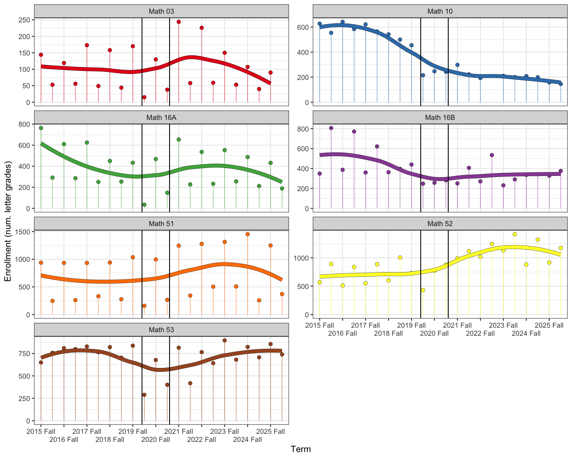
We begin by plotting the number of letter grades assigned in each course over time. Because several of the courses have a strong seasonal effect (eg, many students take first-semester calculus in the Fall, then second-semester in the Spring), we include a local regression smoother. The vertical black lines bracket Spring 2020, Fall 2020, and Spring 2021, covering the three semesters where the UCs were remote and allowed students to take any course pass-fail, resulting in fewer assigned letter grades.
Figure 1: Course enrollments (total assigned letter grades), Fall 2015 through Spring 2026
One very obvious trend is that, since about Fall 2017, the number of students taking the 10 sequence (calculus for life sciences) has dropped substantially, by about 400 students per semester. Math 16 enrollments also began to drop around Fall 2017 or 2018, though with a bump in Fall 2021 that has since gone down. These trends predate both the pandemic and UC going test-free. On the other hand, Math 51 and 52 enrollments jumped up starting Fall 2021.
The trajectory of Math 03 (Precalculus) is also notable. The first few years after Covid, Fall enrollments jumped by roughly 100 students; though this appears to have been temporary, as recent Falls have had enrollments below the pre-Covid average. Spring enrollments were basically unchanged.
If there were a sustained, substantial increase in underprepared students at Berkeley, we might would expect to see a very different pattern for Math 03: either a sustained jump, relative to the pre-Covid average (as more students get placed into Math 03, or fail Calculus I and go back to retake Precalculus); or an increase over time (as the faculty begin to recognize the problem and make their placement process more rigorous).
Course GPA
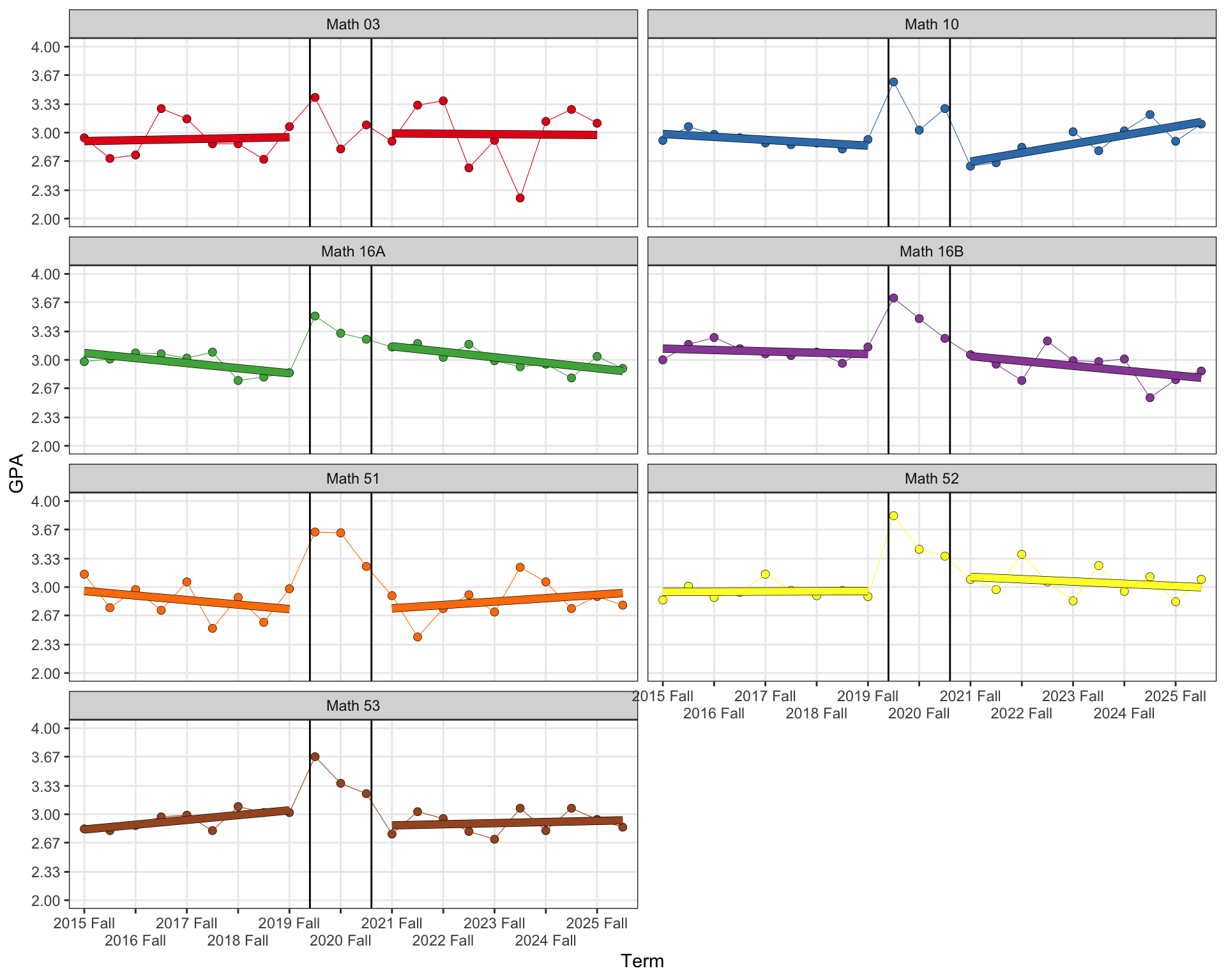
Next we plot the average course grade, in grade points. These don’t jump around seasonally in the way enrollments do, but we add a linear smooth (here just a simple univariable or OLS regression) to bring out trends. As above, we exclude Spring 2020 through Spring 2021.
Figure 2: Course GPA (average final grade), Fall 2015 through Spring 2026
Visually, the trends before and after 2020 are not the same across classes. Math 3 and 52 are flat both before and after. The most common pattern appears to be an increase post-2020: this shows up with Math 53, the 10 sequence (also for both courses separately), and 51. Only the 16 sequence shows declines since 2020. However, the 16 sequence might have also been experiencing declines before 2020. Math 16A has a decline leading up to 2020, then appears to jump up and decline at the same rate in 2021.
Overall, note that any jumps and any changes in trends appear to be small (outside of the three pass-fail semesters). While there are exceptional semesters here and there, the trends remain close to a B.
Visual inspection of the trends alone might be misleading. To analyze them quantitatively, we fit generalized least squares (GLS) models with a time-series structure in Table 1.5
Code
## Conventional significance stars from a p-value.star_pval =function(p) {case_when( p <0.001~'***', p <0.01~'**', p <0.05~'*',TRUE~'' )}
Code
## GPA time series model ----# Load and prepare data ----dataf_gpa = dataf |>filter(!is.na(average_gpa)) |>filter(term <'2020 Spring'| term >='2021 Fall') |>mutate(year =as.integer(str_extract(as.character(term), '^[0-9]{4}')),raw_time = year +if_else(str_detect(as.character(term), 'Fall'), 0.5, 0),## Index time to 0 at the first semester (Fall 2015, the first## term for every course) so the intercept and periodpost## coefficients are interpretable (fitted GPA and pre/post gap## at the start of the data), rather than extrapolated to year 0.time = raw_time -min(raw_time),period =if_else(term <'2020 Spring', 'pre', 'post') |>factor(levels =c('pre', 'post')) )# Fit one GLS model per course ----models_gpa = dataf_gpa |>group_by(course_grp) |>nest() |>mutate(model =map( data,~gls( average_gpa ~ time * period,correlation =corCAR1(form =~time),data = .x,control =glsControl(opt ='optim') ) ) )# Verification: every course fit, and the correlation structure isn't inert ----invisible(assert_that(nrow(models_gpa) ==n_distinct(dataf_gpa$course_grp)))# models |># mutate(# phi = map_dbl(# model,# ~ coef(.x$modelStruct$corStruct, unconstrained = FALSE)# )# ) |># select(course_grp, phi) |># pwalk(function(course_grp, phi) {# cli_alert_info('{course_grp}: Phi = {round(phi, 4)}')# })# Build the coefficient table, one column per course ----coefs_gpa = models_gpa |>mutate(tidied =map(model, ~ broom.mixed::tidy(.x, conf.int =TRUE))) |>select(course_grp, tidied) |>unnest(tidied) |>ungroup() |>mutate(cell =str_glue('{sprintf("%.1f", estimate)}{star_pval(p.value)} [{sprintf("%.1f", conf.low)}, {sprintf("%.1f", conf.high)}]' ) ) |>select(course_grp, term, cell) |>mutate(course_grp =str_remove(course_grp, 'Mathematics ')) |>pivot_wider(names_from = course_grp, values_from = cell)gpa_table = coefs_gpa |>gt(rowname_col ='term') |>tab_header(title ='GPA trend comparison, pre- vs. post-2020, by course' ) |>tab_source_note('Coefficient estimate [95% CI]. * p < .05, ** p < .01, *** p < .001.' ) |>tab_source_note('AR(1) errors (corCAR1); pass-fail terms (Spring 2020-Spring 2021) excluded.' )gpa_table
Table 1
GPA trend comparison, pre- vs. post-2020, by course
Math 03
Math 10
Math 16A
Math 16B
Math 51
Math 52
Math 53
(Intercept)
2.9*** [2.4, 3.4]
3.0*** [2.9, 3.1]
3.1*** [2.9, 3.2]
3.1*** [2.9, 3.3]
3.0*** [2.7, 3.2]
2.9*** [2.8, 3.1]
2.8*** [2.7, 3.0]
time
0.0 [-0.2, 0.2]
-0.0 [-0.1, 0.0]
-0.1 [-0.1, -0.0]
-0.0 [-0.1, 0.1]
-0.1 [-0.2, 0.1]
0.0 [-0.1, 0.1]
0.1 [-0.0, 0.1]
periodpost
0.0 [-1.8, 1.8]
-0.9*** [-1.3, -0.5]
0.5* [0.0, 0.9]
0.2 [-0.3, 0.8]
-0.4 [-1.3, 0.4]
0.3 [-0.2, 0.9]
-0.0 [-0.5, 0.4]
time:periodpost
-0.0 [-0.3, 0.3]
0.1** [0.1, 0.2]
-0.0 [-0.1, 0.1]
-0.0 [-0.1, 0.1]
0.1 [-0.1, 0.2]
-0.0 [-0.1, 0.1]
-0.0 [-0.1, 0.0]
Coefficient estimate [95% CI]. * p < .05, ** p < .01, *** p < .001.
In this model, (Intercept) is the expected course GPA in Fall 2015, and time shows the trend, how course GPA changed per year, across the entire time frame of the data (excluding the three pass-fail semesters). periodpost shows how course GPA changed at the break between pre- and post-Covid terms; you can think of this as how far the trend jumped vertically at that break. And time:periodpost is how much the annual trend changed post-Covid. For example, for Math 10, the best estimate for the annual trend pre-Covid is -0.03 (course GPA decreasing by .03 grade points per year) and the best estimate post-Covid is 0.11 (increasing by .11 = -.03 + .14 per year). The values in brackets are 95% confidence intervals around the point estimate, and stars indicate statistical significance against the hypothesis that the true value of the parameter is 0.
While I’ve included statistical significance in the table, I prefer to focus on the confidence intervals, and UCLA statistician Sander Greenland’s (2019) interpretation of them as compatibility intervals.6 On this interpretation, the intervals indicate the range of values that are compatible with the data and modeling assumptions. Here, for every course, the data and assumptions are compatible with both positive and negative trends, and (except for Math 10) both positive and negative changes in these trends since Covid. With this modeling approach, the data are highly ambiguous. They’re compatible with flat overall trends; they’re compatible with decreasing trends pre-Covid and improvement since Covid; and they’re compatible with the catastrophic negative trends claimed by SAT proponents.
Arguing with SAT supporters on Reddit, one common line of thought is that grade data are unreliable because of practices like grade inflation and norming/lowered expectations. One reason for looking specifically at UC Berkeley is that Berkeley Math faculty are among the most prominent SAT supporters. It therefore seems unlikely to me that these same faculty would be taking steps to conceal the problem and passing students who should be failed. This is, nonetheless, a possibility.
Failure rate
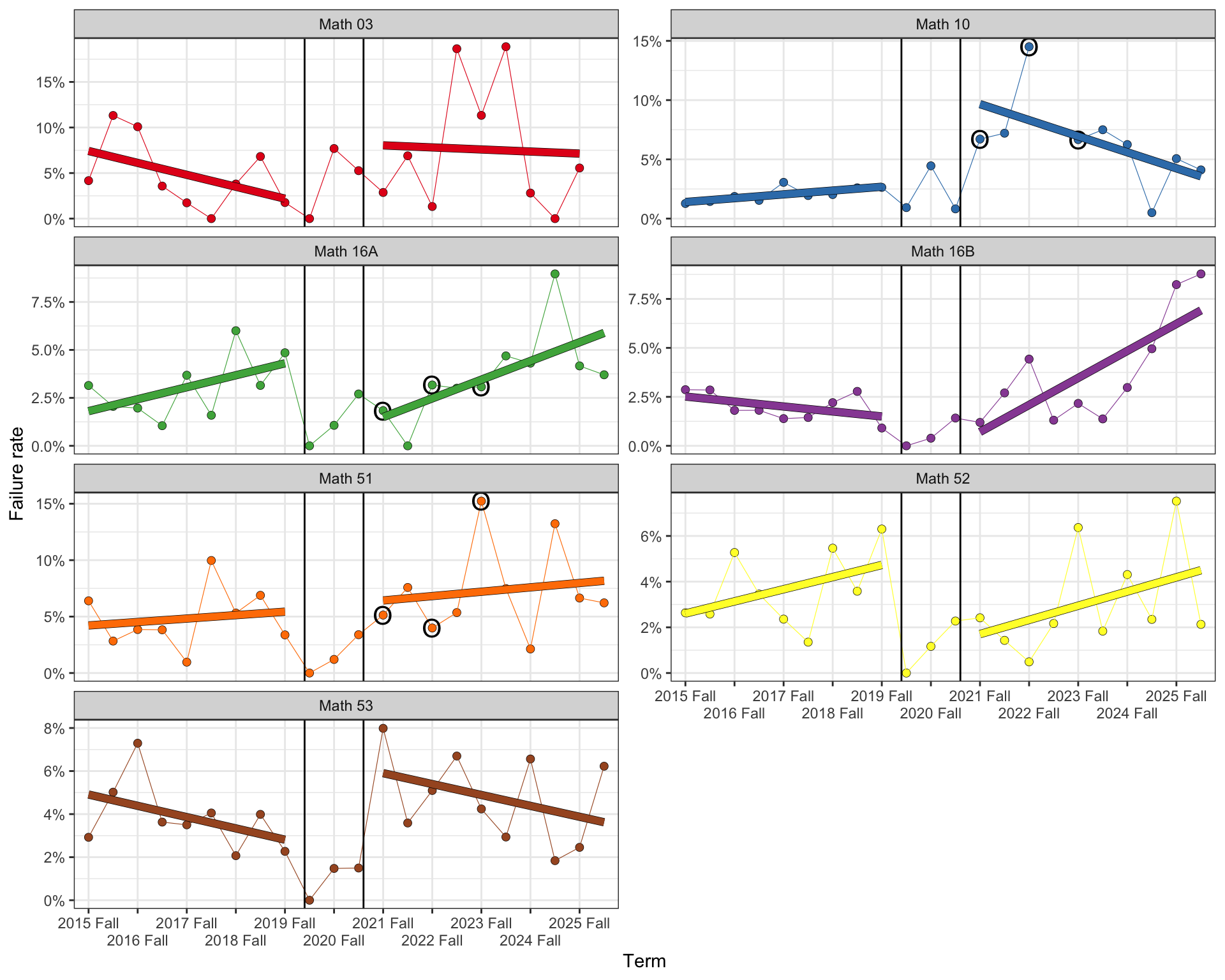
Instead of overall averages, SAT supporters might prefer to focus on the failure rate. For example, Stankova et al. warn of a “U-shaped bimodal distribution” with large increases of underprepared students. This could lead to increases in the fraction of students who receive an F without changing the overall average. I think failure rate would also be less influenced by slightly more generous grading practices: in my experience teaching college math, most students who fail a math class are well below the threshold to pass, and the grading nudge that gets some B+ students up to an A- doesn’t help a lot of failing students.
Figure 3: Rate of F grades, Fall 2015 through Spring 2026
These failure rate data show much larger term-to-term variation than the course GPAs, especially post-Covid. Math 16B (Calculus II for social scientists) certainly shows a striking increase in failures post-2020. However, presumably students in 16B either passed 16A at Berkeley or scored a minimum grade on an AP test; it’s hard to see how this trend could be attributed to high school grade inflation or UC ending use of the SAT.
Code
## Failure rate time series model ----# Load and prepare data ----dataf_f = dataf |>filter(!is.na(f_rate)) |>filter(term <'2020 Spring'| term >='2021 Fall') |>mutate(year =as.integer(str_extract(as.character(term), '^[0-9]{4}')),raw_time = year +if_else(str_detect(as.character(term), 'Fall'), 0.5, 0),## Index time to 0 at the first semester (Fall 2015, the first## term for every course) so the intercept and periodpost## coefficients are interpretable (fitted failure rate and## pre/post gap at the start of the data), rather than## extrapolated to year 0.time = raw_time -min(raw_time),period =if_else(term <'2020 Spring', 'pre', 'post') |>factor(levels =c('pre', 'post')),f_rate =100* f_rate )# Fit one GLS model per course ----models_f = dataf_f |>group_by(course_grp) |>nest() |>mutate(model =map( data,~gls( f_rate ~ time * period,correlation =corCAR1(form =~time),data = .x,control =glsControl(opt ='optim') ) ) )# Verification: every course fit, and the correlation structure isn't inert ----invisible(assert_that(nrow(models_f) ==n_distinct(dataf_f$course_grp)))# models |># mutate(# phi = map_dbl(# model,# ~ coef(.x$modelStruct$corStruct, unconstrained = FALSE)# )# ) |># select(course_grp, phi) |># pwalk(function(course_grp, phi) {# cli_alert_info('{course_grp}: Phi = {round(phi, 4)}')# })# Build the coefficient table, one column per course ----coefs_f = models_f |>mutate(tidied =map(model, ~ broom.mixed::tidy(.x, conf.int =TRUE))) |>select(course_grp, tidied) |>unnest(tidied) |>ungroup() |>mutate(cell =str_glue('{sprintf("%.1f", estimate)}{star_pval(p.value)} [{sprintf("%.1f", conf.low)}, {sprintf("%.1f", conf.high)}]' ) ) |>select(course_grp, term, cell) |>mutate(course_grp =str_remove(course_grp, 'Mathematics ')) |>pivot_wider(names_from = course_grp, values_from = cell)f_table = coefs_f |>gt(rowname_col ='term') |>tab_header(title ='Failure rate trend comparison, pre- vs. post-2020, by course' ) |>tab_source_note('Coefficient estimate [95% CI]. * p < .05, ** p < .01, *** p < .001.' ) |>tab_source_note('AR(1) errors (corCAR1); pass-fail terms (Spring 2020-Spring 2021) excluded.' )f_table
Table 2
Failure rate trend comparison, pre- vs. post-2020, by course
Math 03
Math 10
Math 16A
Math 16B
Math 51
Math 52
Math 53
(Intercept)
6.8 [-3.6, 17.1]
1.4 [-1.9, 4.7]
1.8 [-0.2, 3.8]
2.8 [-6.5, 12.0]
4.2 [-0.2, 8.6]
2.6* [0.3, 4.9]
4.9*** [2.7, 7.1]
time
-1.1 [-5.3, 3.1]
0.3 [-1.0, 1.7]
0.6 [-0.2, 1.5]
-0.5 [-2.4, 1.4]
0.3 [-1.5, 2.1]
0.5 [-0.4, 1.5]
-0.5 [-1.4, 0.4]
periodpost
0.1 [-35.6, 35.7]
16.0** [5.6, 26.4]
-6.2 [-12.6, 0.3]
-11.8 [-26.7, 3.0]
-0.1 [-14.0, 13.7]
-4.6 [-12.0, 2.7]
4.0 [-2.9, 10.9]
time:periodpost
1.1 [-4.8, 7.1]
-1.6 [-3.4, 0.2]
0.4 [-0.8, 1.5]
2.2 [-0.5, 4.9]
0.1 [-2.3, 2.5]
0.1 [-1.2, 1.4]
0.0 [-1.2, 1.2]
Coefficient estimate [95% CI]. * p < .05, ** p < .01, *** p < .001.
Table 2 uses a percentage point scale, eg, the intercept for Math 03 is 6.8%, and the point estimate for the annual change is -1.1 points. Note that this model allows impossible negative values, eg, -3.6% of Math 03 students failing.7
The failure rate models are even more ambiguous than the course GPA models, due to the large variation in failure rates. There is evidence of a substantial jump in failure rates for Math 10, somewhere between 5 and 24 percentage points; but not for any of the other courses. The compatibility intervals suggest that the Math 16A failure rate either did not change post-Covid or dropped substantially.
In no case do we have strong evidence for an increasing trend or an acceleration of the failure rate since Covid.
Data gaps in the UCB report
Stankova et al. use diagnostic testing data and course grades to make the following argument:
“[T]he share of strongly prepared students is shrinking while the share of students with severe preparation deficits is growing” (pg 1).
Students who scored low on a diagnostic exam were more likely to fail Calculus I (3).
Conversely, students who failed Calculus I were more likely to score low on the diagnostic exam (7-8).
Therefore, Covid is not “the only or the major factor” explaining “the general decline in math preparation” (7).
Therefore, “mathematical readiness is the primary predictor of success in university-level STEM” (8).
“The suspension of standardized testing requirements … [is] correlat[ed] with an increase in student attrition within early STEM courses” (8).
Therefore, “Restoring standardized data points is necessary to properly align academic support systems with student needs and ensure a viable path to success for everyone admitted to a STEM major” (8), that is, the UC should resume requiring the SAT for admissions.
The data they present is generally inadequate to support this argument. They consider just three semesters of Calculus I: Fall 2021, 2022, and 2023. Without any pre-Covid data, they have no way to assess the relative impact of Covid (in re claim 4). Indeed, they do not examine any predictors of course grades other than diagnostic exam scores, and so have no basis to assess the relative value of exam scores/readiness/preparedness as a predictor (in re claim 5).
Because the diagnostic exam was not administered in Fall 2024 and 2025 (2n3), it’s unknown whether the trend in claim 1 continued beyond Fall 2023. Even for the three-year period they do examine, this trend may be confounded: the data (3) were collected from different classes each semester;8 because these different classes serve very different populations of students, the apparent trend could be an artifact of stable differences between majors rather than changes over time.
On the other side of claims 2 and 3, even if there were an increasing trend in unprepared students and it continued beyond Fall 2023, Stankova et al. do not provide any data on trends in course grades or failure rates; our analysis in Section 1.3 did not find clear evidence of trends in Calculus I, one direction or the other. In Figure 3, I’ve highlighted Fall 2021, 2022, and 2023 with black circles for the three Calculus I courses. It’s unclear if Math 10A was included in Stankova et al.’s analysis at all; but Fall 2022 was an outlier high failure rate in that class. Math 51 had a similar outlier in Fall 2023. So, even if the authors did make a claim that failure rates were increasing (and did adjust for course in this analysis), that trend could be an artifact of using data from just a few semesters with strong outliers.
Claim 6 has two major data issues. On the one hand, as with claim 3, because Stankova et al. do not look at any data from before the UC went test-free, it’s impossible to make any claims about how anything has changed since that time. The variance of the SAT vs. test-free variable in their data is exactly zero, and that means any correlation is undefined. On the other hand, they do not provide any data on attrition per se, ie, students switching out of STEM majors or dropping out of Berkeley entirely. We might use failing Calculus I as a proxy for attrition (though many such students take it again rather than leave); but, again, there’s no clear evidence of increasing failure rates in either of the STEM Calculus I courses.9
None of this is to say that any of claims 1-7 is false.10 My point is that the evidence required to support for these claims is either ambiguous or unavailable. I don’t have compelling evidence that SAT proponents are wrong. But they also don’t have compelling evidence that they’re right.
Making policy with ambiguous data
The interpretation of data always requires assumptions: about unobserved aspects of the processes that produced it; about quality, completeness, and accuracy; about which available data to include and which to drop; about how the statistical questions that can be directly answered with the data relate to the substantive questions that originally motivated inquiry. Usually there is not one obviously correct way to make these assumptions; reasonable people can disagree. But often these reasonable disagreements can lead to radically different interpretations.
For example, my analysis of failure rates did not include D grades or withdrawals; but faculty and administrators often look at the combined rate of Ds, Fs, and withdrawals (DFWs). I chose not to look at Ds because it made data collection simpler, faster, and more robust,11 while withdrawal data wasn’t available at all. And students withdraw for many reasons besides lack of preparation: in my experience, they’re most likely to withdraw due to things like a death in the family or serious health issues. Nonetheless, combined DFW rates are a standard metric, and so might reasonably be preferred. It is possible that combined DFW rates would show a concerning trend that does not appear in the F rates alone.
It’s especially important to be thoughtful about the assumptions we’re using when the data indicate significant ambiguity and the conclusions we reach have socially significant implications. In the context of the SAT controversy, we should think specifically about how different sets of assumptions and evidentiary requirements fit with different visions of what the overall purpose of the UC should be.
On the one hand, critics of the SAT (supporters of the test-free status quo) appeal to egalitarian values, specifically what Rothstein (2026) characterizes as “the UC’s role as a public university and its commitment to providing fair access to students regardless of their backgrounds” (16). Going test-free has improved access for Black, Latino, and American Indian Californians and first-generation students (Rothstein 2026, 5–6), and so the case for bringing back the SAT requires fairly strong evidence of negative outcomes or significantly increased costs (eg, on remedial or support courses).
On the other hand, proponents of the SAT appeal to the values of prestige and elite achievement (in a positive sense), characterizing the UC as “a California version of the Ivy League” that “provide[s] cutting edge education to those operating at the frontier” (Hoofnagle 2026). Stankova (2026) appeals to the fact that MIT, Stanford, Harvard, Yale, and other “peer universities” “across the Ivy League” have resumed requiring the SAT. From this perspective, increased racial and class diversity per se is unimportant,12 and the need for faculty to devote more time to supporting underprepared students is an unfair imposition on “California’s research-ready students” (Hoofnagle 2026). For these proponents, evidence of decreased preparedness alone may be sufficient to establish that there is a crisis in calculus; indeed, focusing on course outcomes, as I have done in this post, may conceal the unfair distribution of resources away from highly prepared students.
So different values can lead not just to different interpretations of the same evidence, but also requirements for different kinds of evidence to address different substantive questions (student demographics and course outcomes vs. diagnostic/placement exam scores).
This kind of entanglement of data and values, empiricism and policy, has become a major topic in philosophy of science over the past twenty years. This semester at UC Merced I’m teaching “Science, Technology, and Values,” an introductory undergraduate course that explores these topics. We’ve been reading Kevin Elliott’s A Tapestry of Values(2017). Elliott makes three general recommendations for managing the influence of values in science. I think UC — the faculty Senate, the Office of the President, and the Regents — should adopt all three as we debate the role of the SAT in UC admissions.
First, transparency. When possible, the data used to make our arguments for and against use of the SAT should be publicly available; and analysis results should always be public. Similarly, we should be explicit about the values we hold and how we would prioritize conflicting values, such as egalitarianism vs. achievement. And we must recognize that there is not a neat division here between “objective fact” and “subjective opinion”: value-landen assumptions are necessary to inform what data we collect, how we analyze it, and what interpretations we draw from the results. There is no neutral, value-free position from which to resolve these disagreements, and we should openly acknowledge that.
Second, critical scrutiny. More than thirty-five years ago, in light of already-well-established critiques of traditional conceptions of objectivity, the philosopher of science Helen Longino (1990) argued that objectivity should be re-conceptualized as a property of scientific communities rather than individual scientists. On Longino’s conception, a community is objective insofar as it enables the uptake of critique and productive debate across different intellectual and value-laden perspectives. In this post, I’ve been critical of the arguments made by my colleagues at Berkeley. This is not to impugn their character or win points on social media, but instead to ensure that we’re making significant policy decisions based on the best available evidence and argumentation. If those colleagues — or other SAT proponents — can fill in the data gaps I’ve identified or point out errors with my own analysis, then that will likely improve the debate.
It’s important to recognize that we will always be more critical when we disagree with someone, and give a pass to weaker arguments with which we agree. So I think BOARS and the Regents should make a point of actively inviting contributions from SAT opponents. News media has given considerable attention to the SAT proponents, creating a perception that “most UC faculty” want the SAT back. But the open letters have been signed by only about 3,000 faculty, compared to about 26,000 systemwide. That’s just over 10%. And more than half of the signatories come from just three campuses, Berkeley, San Diego, and UCLA. Thanks to the work of Stankova and a few of her colleagues at Berkeley, SAT supporters have the advantage of being more organized and louder. But this doesn’t mean their position is well-supported by the evidence they have presented. BOARS might, for instance, facilitate an exchange of briefs and critiques, to consider how well SAT proponents might address the arguments of SAT critics and vice versa.
The first two points have been procedural, in that they clarify how the influence of values should be managed but not which values should have such influence. I assume no reasonable person thinks explicitly white supremacist values should play a role in the SAT debate. Here Elliott recommends representative values, that is, the values held by the public that some body of research aims to serve. Suppose 95% of UC faculty agreed with SAT supporters, and believed that we should bring back the SAT to promote merit-based access and the highest levels of achievement. It might still be inappropriate to settle the debate in favor of SAT proponents if the people of California instead valued egalitarian access. The Regents are nominally appointed to represent the people of California; but it’s doubtful this is actually a factor in their appointments. It would be useful to hold deliberative public fora or conduct deliberative polling to gauge the views of the public on the SAT and the relative importance of egalitarian access vs. elite achievement. It may be especially important to incorporate perspectives from disadvantaged communities in places like the San Joaquin Valley, rural Northern California, or Black communities in Greater Los Angeles.
Going beyond Elliott, a final recommendation I would make would be to take an adaptive management approach (Norton 2005; Mitchell 2009). First developed in natural resources management, adaptive management recognizes that our understanding of complex systems is inevitably incomplete, and thus it is impossible to design optimal policy strategies in advance. Instead, managers should work closely with researchers, actively collecting data on the impacts of policy as it is implemented, and periodically update the policy in response to the new data.
Whether the UC brings back the SAT or not, it seems likely there will be significant value in adopting a systemwide placement exam, required of all students who do not place above Calculus I, and tracking placement and course outcomes carefully across all campuses. If UC does require the SAT, the placement exam results (and their ability to predict Calculus I outcomes) would be useful for assessing to what extent the SAT is measuring mastery of high school math rather than family income (Rothstein 2026, 14ff). If UC does not, then placement exam data could be used to identify enrolled students who need additional support, and which campuses might need additional state funds to provide that support.
The policy should also be revisited regularly, perhaps with annual data updates, a report every 2-3 years, and a whole policy review every 6-7 years. This would formalize the process of comparing the policy-as-intended to the policy-as-implemented, actively looking for emerging problems, and adjusting accordingly.
References
Ali, Ridda, Andrew Prestwich, Jiaqi Ge, et al. 2025. “Composite Variable Bias: Causal Analysis of Weight Outcomes.”International Journal of Obesity 49 (6): 1043–50. https://doi.org/10.1038/s41366-025-01732-6.
Berrie, Laurie, Kellyn F Arnold, Georgia D Tomova, Mark S Gilthorpe, and Peter W G Tennant. 2025. “Depicting Deterministic Variables Within Directed Acyclic Graphs: An Aid for Identifying and Interpreting Causal Effects Involving Derived Variables and Compositional Data.”American Journal of Epidemiology 194 (2): 469–79. https://doi.org/10.1093/aje/kwae153.
Elliott, Kevin C. 2017. A Tapestry of Values: An Introduction to Values in Science. Oxford University Press.
Greenland, Sander. 2019. “Valid P-Values Behave Exactly as They Should: Some Misleading Criticisms of P-Values and Their Resolution With S-Values.”The American Statistician 73 (sup1): 106–14. https://doi.org/10.1080/00031305.2018.1529625.
The UCSD report says that, before about Spring 2024, Berkeley “had … been unique among the UC campuses is not offering any course below calculus” (12). This appears to be incorrect. Berkeley Math maintains a public archive of course offerings, which confirms that Math 32 (Precalculus) was offered regularly. Math 32 was renumbered as Math 03 starting Fall 2025. Berkeley Math did create a new course around this time, Math 01, Foundations of Lower Division Mathematics; but this appears to be a 2-unit support course for Calculus, not a remedial pre-precalculus course.↩︎
These appear to typically be offered in alternating semesters, so we treat them as a single course, Math 10. It appears neither was offered in Spring 2023.↩︎
Prior to Fall 2025, Math 51 and 52 were 1A and 1B. The data record the course numbers used for each class at the time, but these are combined when the data are loaded.↩︎
I’m not fluent in time series analysis myself, so I used Claude Code (Sonnet 5) to prepare this analysis. I also had Claude generate this explanation of how the model differs from unvariable regression/“OLS”: OLS assumes each term’s error — the part of GPA the model doesn’t explain — is independent of every other term’s error. That’s usually false for data collected over time: this semester’s grading norms and instructor pool resemble last semester’s, so nearby terms’ errors correlate (temporal autocorrelation), which leaves OLS’s standard errors too small and its significance tests overconfident. Generalized least squares (GLS) instead fits the regression coefficients and a model of that correlation together. The correlation model used here is AR(1) (“autoregressive, order 1”): each term’s error is a fraction φ of the previous term’s error plus new noise, so correlation between two terms decays the farther apart they are — fast if φ is near 0, slow if φ is near 1. Standard AR(1) assumes evenly spaced observations; corCAR1 (“continuous-time AR(1)”) instead uses each pair’s actual elapsed time, so gaps from excluded or missing terms count as weaker correlation, not an ordinary one-term step.↩︎
As of July 16, 2026, Greenland was not on the list of signatories of the pro-SAT open letter.↩︎
Ratio variables can also introduce composite variable bias into causal inference (Berrie et al. 2025; Ali et al. 2025). A better approach here might be a negative binomial model of the absolute number of F grades as a function of total enrollments and latent failure rate (our estimand), combined with the time-series autocorrelation structure. This could be built using stan, popular software for Bayesian modeling. However, this blog post is already too long and complex, so I decided to stick with the simpler model.↩︎
The authors explain that “The other Calculus 1 class did not take the [diagnostic exam] in Fall 2022” (3n4), and report a total of 652 students including those who did not take the diagnostic exam. But of course the letter grade data above and Berkeley Math’s course offerings archive indicates that all three Calculus I courses ran in Fall 2022, with about 200 students receiving a letter grade in Math 10A, 550 in Math 16A, and 1,250 in Math 51 (then 1A). So it’s not clear which classes took the exam and which one(s?) was(were?) “the other … class” that did not take the exam. The table does include students who withdrew, so it could be the exam was administered only in Math 16A in Fall 2022 (and ~100 students withdrew before receiving a letter grade), while it was administered in both Math 16A and 51 in the other two years. However, the authors report 1,374 total students for Fall 2021; that semester Math 51 alone had about 1,250 letter grades, and Math 16A had somewhere around 650. The numbers are similar for Fall 2023, with somewhat more students than letter grades for Math 51 alone but far too few for both Math 51 and Math 16A. To say nothing of Math 10A.↩︎
There is evidence of a trend for Math 16B, a version of Calculus II primarily for social scientists. For better or for worse, social sciences are typically not included in “STEM,” and I assume Stankova et al. make this same exclusion. Further, as I pointed out above, students in Calculus II should have already passed Calculus I either at Berkeley or on the AP test; so conditional on enrollment in Math 16B we would not expect to see any correlation with the SAT requirement.↩︎
Though the combination of claims 1-3 with the flat failure rate trends we observed above is highly unlikely: Insofar as preparedness is dropping, and preparedness is strongly (negatively) correlated with failure rates, we would expect failure rates to be increasing.↩︎
Claude had to use some fragile browser integration commands to access the data for specific letter grades.↩︎
The “diamond in the rough” argument for the SAT posits that using the SAT in admissions improves access for students from disadvantaged backgrounds with poor or middling grades who do well on the SAT in line with their potential. This argument does not value racial and class diversity per se (“in itself” or “for its own sake”), but instead allocating opportunity in line with “merit,” as measured by the SAT and regardless of whatever the relationship happens to be between “merit,” race, and class. Increased diversity is seen as at best a happy side effect of merit-based allocation — if it happens to result in increased diversity.↩︎